Here's my repost. I know the pictures aren't great technically (I think I should learn how to make technical OK pics once!), but I like the sequence. I put a lot of effort in 'rhytm' (the hole getting bigger and smaller. People 'in' the hole or out of the hole. B/W and color. Static pics and moving pics. I'm really interested in the way people stand, how they move. I'm often struck by the way you can recognize people from a far distance, not by their faces or clothes but by their stand. Having the same object in each picture (the hole) makes it easyer to identify this stand. Besides I really love Anish Kapoor. And I like the abstraction / the 'graphic' feel the hole gives to the pics.
If you are so kind to comment please tell me if the rhytm op the pics works for you, maybe some technical tips? Too many of my pics unsharp, too dark or too light. Thank you.
Museum Visitors


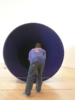

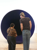


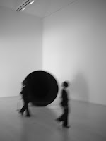


Taken on a Free Tuesday in front of Anish Kapoor's 'Hole'
If you are so kind to comment please tell me if the rhytm op the pics works for you, maybe some technical tips? Too many of my pics unsharp, too dark or too light. Thank you.
Museum Visitors


Taken on a Free Tuesday in front of Anish Kapoor's 'Hole'
This is one of my favorite sets. I think you mixed the color with the b&w beautifully.
ReplyDeleteThe rhythm works great for me.
You shouldn't be so harsh on yourself for not having technically perfect photos. I didn't even think about that when I first saw your photos. Good job!
I love this set of pictures! I thought it was great that you captured the different ways that people experience a museum exhibit. I also really like the rhythm, it makes them more interesting. Great job!
ReplyDeleteI agree, when I saw these pictures online I felt very jealous about how well you did the typography. It's interesting, it really captures the way a museum is a dynamic place, not static at all. I like how some people are alone, and some having social experiences. It's great that it's recognizably all the same while still having the movement you talked about. I think I might have liked one or two pictures with no visitors at all!
ReplyDelete